Wednesday, January 31, 2007

PDA Shopping in America (example)

This is a great little article where a system like mine has been implemented before, have a look.

http://gtresearchnews.gatech.edu/newsrelease/grocerypda.htm

PDA Shopping in America (example)

This is a great little article where a system like mine has been implemented before, have a look.

http://gtresearchnews.gatech.edu/newsrelease/grocerypda.htm

RFID


Radio Frequency Identification, An RFID tag is an object that can be attached to or incorporated into a product, animal, barcode, or person, for the purpose of identification using radio waves. The tag's antenna picks up signals from an RFID reader or scanner and then returns the signal, usually with some additional data (like a unique serial number or other customized information).


The chip can be the even smaller than a grain of rice, many supermarkets implement in store with the chip embeeded in the barcode.


Many supermarkets use RFID tags in CDs and the most stolen item, Razor Blades, this use of technology has come under some arguement as some people see this as spying on customers.


"The technology's supporters offer an idyllic image of a future where dangerous criminals can be 'tagged' and you could breeze through supermarkets and have the bill paid automatically by your debit card simply by walking past a scanner at the door without having to queue".
So maybe with this technology, RFID tags could be placed just in the shelf barcode allowing the users whilst on the PDA to locate the items with the use of an RFID scanner which is in the PDA.


tits

Monday, January 29, 2007

The Concept


Have you ever wanted to find the desired ingredients to make your favourite dish, but you have forgot your list? or cant remember when your doing your normal shopping? , well no need to worry as the Recipe finder is at hand.
At your fingertip you will have the ability to choose recipes based on your two favorite items of food which will definitely tantalize your taste buds. Your recipe item locations will be displayed in front of you on the screen in order as you begin your shop, so you can move around the store in a straight forward way straight to the till.
You don't even need to worry about cooking the meal, at the end of your shopping, simply plug the Recipe Finder into the Print desk in store and collect your recipe. When doing your normal shopping, you can add a little extra.
Cooking luxurious meals for yourself and others have never been so easy.

The Recipe Finder will be attached to the front of a section of trolley's as you enter the store, when you first start, you will be asked what type of recipe you would like to choose:

It is here where the user can choose which type of recipe they would like, either a quick and easy option, a low cost recipe, a medium recipe, a top quality recipe with ingredients from Tesco's finest for example, or a party/Buffet option, where the user can choose a selection of wide range of food that would be normally seen at a party.

Once the user chooses a type of recipe, then then get to type in their favorite food items into the PDA using the the keypad. The idea of the keypad is that it is set out just like a computer keyboard so users will be familiar with how it works and how they input information.
This is the screen where the user types in two key food items that they wish to include in their desired recipe.

Once the user inputs 2 key food items, the database of selected recipes on the PDA will bring up a selection of recipes to choose from. The Recipes selected will be based on the stock of the supermarket.
The users gets presented with this screen below where they can choose a type of recipe, they can look to see what ingredients are in the recipe and also have a look at a picture of the finished item.

The user will choose a recipe from the selection, they will then be shown a picture of how they recipe will look and a brief description:
The user the views the recipe by navigating the keypad joystick down to 'GO'
The user simple navigates the joystick down until 'GET' is selected. Once the recipe is selected then the ingredients will be marked out on each aisle in order as move around when doing your normal shopping. These item bar code's are attached with a RFID tag which is a device where the tag can be detected at any place. The detector will be located in the PDA which then detects the RFID signaling the item in the aisle which is then displayed on the PDA marked with a red square. The user position is also show on the PDA, which also has a RFID tag , so as you move around this green circle will follow you around so you know where you are all the time.
As each item is next approached, a description of what the item is and a price will be shown on the PDA screen.
As the user approaches each item a packaging picture will appear on the screen giving the user help in finding the correct item.
As item is put into the trolley pressing the green enter button on the PDA will remove it from the list, allowing the user to continue their shopping and find the next recipe.
Once all the recipe items are collected, then the user will continue to the checkout and pay for them items.
With the selected recipe stored onto the PDA, the user simply detaches the PDA from the trolley, and attaches it the the printing desk, where the users prints out the instructions on how to cook their desired recipe!!

Simple as that!! Please give me your suggestions

Sunday, November 26, 2006

Initial Corporate Indentity

I thought as I have a name for my device and a function, i could mess around with the logo design and layout, these are just a few prototypes of design for the REICIPE FINDER, have a look. I have also tried to see how my device would or could be incorporate with a major supermarket like Sainsbury's. See what you think

This above was just a range of different typefaces, I wanted it to be flowing with class and sophistication, I thought cooking a luxury meal with my device should be reflected in my luxury text!! it gives a sign of class to my users, something that their end product will be also.

None of these type faces are chosen on just yet, but it gives me a few ideas.

This was the first design for my logo, I designed this is photoshop using a range of different sized lines, and then distorting a skewing them to make to sharp points. I wanted the logo to look modern and comtempary, as my device is new in technology, the Logo should reflect it. And I think it works, and obviously my device will be implemented in the supermarket on a trolley, so.........


This is the chef, a simple but effective stick drawing in photoshop, I also made a chef's hat that sits on top of his head to make it more recognisable for my audience to work out, also the comedy chef's tash was also implemented on his face to add a bit of humor to my design. The reason the sitting position is shown next. He's not on a toliet!!
This will maybe be my final design, the reason for the chef sitting on the front of the trolley symbolises that the PDA will be positioned on the front handle of the trolley, it is bascially like having a chef in front of you as your shop around, this is the man inside the PDA giving you all of these luxury recipes to cook.
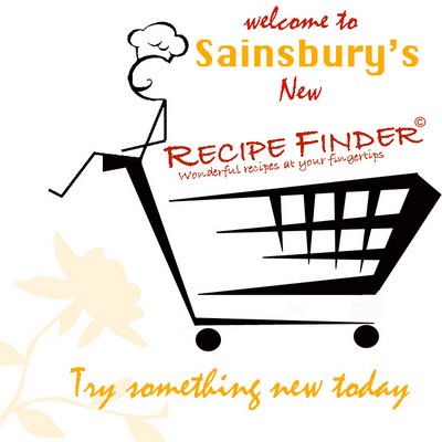
Ok thats the main design for the corporate identity, it will probably be modified later on, but it shows you my design process.
The next part happened when I woke up at 7.30 this morning to play football, much to my dissapointment the game was cancelled due to the lovely weather down here in Portsmouth, so I thought I might aswell turn my MAC on, and when browsing, i saw a advertisment for Sainsbury's on a webpage, I can't remember the website but it thought about how my logo design could be incorporated into a advertisment for SAINSBURY"S.
This could be implemented on posters in store, adverts in magazines, or even a pop up advertisment on the internet. In have used Sainsbury's corporate indentity with their orange colours and slogan at the bottom, but I thought if a major corporation was to use my device in their store, then more than likely they will make my logo match their identity.
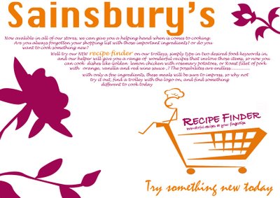


CLICK TO ENLARGE IMAGE

The Sainsbury's colours have taken over my product! but in a way looks far better than the black, I suppose any corporate colour would be choosen over the black. these were just a few quick ideas I made up at 7.30 this morning. it just gives me a slight overview on how my design would look within a business identity.

Saturday, November 25, 2006

The cognitive Model

Our behaviours and thoughts when we interact with a device and our decisions with respect to relevent map-based tasks such as navigating, can form a visual model in our brain. This model helps us to predict how we are going to perform on a system or device. This simplified representation of reality contains the information and thoughts about the functions, capabilities and limitations of any device as we interact with in our minds.

"This memory is the mental peice of scrap paper we use as we complete our goals"
(Mobile Interaction Design, Matt Jones & Gary Marsden p.92)

navigation is merely telling you to go i.e BACK/FOWARD, NEXT/PREVIOUS when navigating around any new device, the users needs to be told how to do this, what they are expected to do, what the limitations are and mostly importantly what to do.
This makes up the model that the user has in their head when they are NOT using your device.
This can be shown in an everyday scenario below:

"Think about showing up at an exotic restaurant without knowing anything about the cuisine. What should you wear? How do you order? How do you pronounce it? What's good? Where's the bathroom? And what's it all going to cost?"
This scenario was taken from ('Recipe for a successful Website' Nathan Shedroff p.6)

It explains the situation from a users point of view. If this user who went into the restaurant and asked these continous questions, obviously they will become extremely fustrated, and more than likely not stay for long, and probably wont come back. If this is alternatively successful, then before you decide where to eat next this postive thought of that restaurant will remain in your head, and your more than likely go back for some more.
And it works that exactly the same are users interact with your device, if their user experiences are good they will use it again, if not they will find another device which is much more understandable, and with less questions.

So if my device and interface is going to 'User friendly' simple to understand and doesnt ask many questions for the user to work then their thoughts of my device and interface will be positive during and out of interaction time. Their confidence and understanding of the device will be extremly high if i help the user during interaction. As Shedroff mentioned it needs to tell them what to do, how to do it and where to do it, all of these helping aspects should contribute to my device being successful during use and when not in use.

This is a model from http://www.longleaf.net/ggrow/StrategicReader/StratModel.html


AH HA a successful cognitive model is created, easy hey? I am sure to find out!


The Recipe Finder- Great recipes at your fingertips

Recipe Finder

When you are out and about shopping at your supermarket, have you ever thought of cooking something a little bit different instead of chicken and chips, pasta, jacket potato, and the trusty frozen meal from a cardboard box? Cooking something different isn’t that hard, you might want the ingredients for peanut noodles with pork? Spicy Piri Piri Chicken? Or a Mediterranean Shepherd’s Pie? But you don’t know what to buy or what goes in it. Some meals only contain a few ingredients that set the flavour and texture, You could by the boring mother disappointing your kids, or the partner who has no imagination when at the hob, who also heads straight to the frozen meal section and picks out the next best thing, a standard shepherd’s pie for £1.00. This won’t do much for your reputation as a cook or host, or even your diets. And every woman loves a good cook, and every man likes a good meal.

So my idea is the Recipe Finder, the next time you are frantically rushing down the aisles picking out ready meals for 4 for a fiver its time you made it yourself. A PDA will be stacked on a rechargeable shelf inside entrance of the store, secure it onto the trolley handle and your ready to go. It will have a simple design interface with only the Recipe Finder application running.
You type two main key words like Chicken & noodles, leeks and ham, or Tuna and potato into the database, and instantly receive the ingredients for Warm potato and tuna salad, or Creamy Leeks with ham and corn, or a Mediterranean Chicken with aromatic noodles dish (these are just some examples)
Not only will it offer the standard recipe, but also give you the option of making a healthy meal with a low-fat option, or ingredients from the organic range. Making it more personal for each user.

Each item that is chosen for the recipe will have a small product packaging picture that pops up on the PDA screen, this gives the user a greater understanding of what the products look like as they walk down the aisles.
Many users will have allergies and reactions to certain products, normally before they purchase any product they look at the content of the item, users will have the possibility to make the interface show what is in each product before they purchase.

These sorts of recipes only need about 4-5 different ingredients, and take about 1 hour to cook. Not a long time for tantalising your taste buds with something different. and also it will calculate the total price of the recipe before you proceed to that checkout.

The satisfaction you will receive when you lay the dish out on the table with be amazing. Finally your family, partner, or friends will have a break from the norm, a healthy, stomach-filling meal cooked by yourself.

The user interaction will be with a PDA stylus and a simple on screen keyboard to type in the keywords, the remaining buttons on the PDA will act as navigation for the user, NEXT, BACK, QUIT, ENTER all these options will be available by the interaction with they keypad on the front.

Once the user has finished shopping, the PDA gets recharged and ready for the next User.
Please tell me what you think about this idea. Please.

Touch Screen Technology

With my device running a single application, without the distraction of the Windows Mobile screen on view. it will just simply be my interface the users interact with then they are finding their required recipe when they enter the store.
Some handheld pocket PC's are interactive with a touchscreen function, normally with a stylus (thats the sort of pen like device), this is an technqiue that users get used to by time, as it offers much more speed, but only when familiar with, and is becoming a standard convention within the PDA industry.

this information provided by http://en.wikipedia.org/wiki/Personal_digital_assistant#Touch_screen

Touch screen PDAs, including Windows Pocket PC devices, usually have a detachable stylus that can be used on the touch screen. Interaction is then done by tapping the screen to activate buttons or menu choices, and dragging the stylus to, for example, highlight text. Text input is usually done in one of two ways:
  • Using a virtual keyboard, where a keyboard is shown on the touch screen. Input is done by tapping the letters.
  • Using letter or word recognition, where letters or words are written on the touch screen, and then "translated" to letters in the currently activated text field. Despite rigorous research and development projects, this data input method still requires much patience from the user since it tends to be rather inaccurate.
The use of this on screen keyboard could be very hard for the new user to grasp, and could be a problem as they are trying to concentrate on this on screen keyboard to type in their keywords for their recipes, maybe the glare might be an issue also. And their is no way that a user will want to configure their voice with the device before they shop, or even configure their hand writing, just like they say above it 'requires much patience from the user since it tends to be rather inaccurate' something a user will not need whilst shopping.

"PDA converts the characters to letters and numbers. On Palm devices, the software that recognizes these letters is called Graffiti. Graffiti requires that each letter be recorded in a certain way, and you must use a specialized alphabet. For example, to write the letter "A," you draw an upside-down V. The letter "F" looks like an inverted L. To help Graffiti make more accurate guesses, you must draw letters on one part of the screen and numbers in another part"
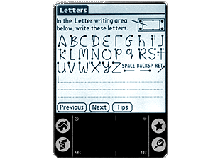
this was from http://electronics.howstuffworks.com/pda2.htm
To be completly honest who wants to even attempt that way of writing? I for sure wouldnt in my own time, let alone walking around a supermarket. Its too time consuming to get used, and a high level of user interaction will be needed, take a look at this picture below to see how it could be a problem for a new user to grasp.

image courtesy of http://www.mysimon.com/i/ba/bg/hh/HHBG_01_300.gif

A steep learning curve for the beginner dont you think?


As for the on screen keyboard function,
it looks just like a regular keyboard, except you tap on the letters with the stylus, on a PDA screen this is very small, users with bad eye sight could maybe not work where they letters are, although it is the same layout. The cramed letters could confuse users, ending in complete fustration and the user not using the device. A new technology is recently been introduced with many applications on a PDA, this is called 'interkey'
This has been introduced on the Pocket PC, is a program that offers a on screen keyboard for which the user can use the stylus to tap each letter to complete the words. it also offers autocomplete function completes words you are typing on the on-screen, as the user begins to spell the word is offers a few suggestions for the user to input.
Its appearence is same layout as a normal QWERTY keyboard at home. This conventions is successful simply on the basis that is it identical as any normal keyboard. Users wont have to think about how to use it, eliminating the bedding in process of such as new technology.
This is an excellent way for users to type , if they have enough practice, but users won't have this possibility as they will be unfamiliar with the PDA as a device, and this as a program.

image courtesy of http://www.mobireach.com/upload%5C%5C124%5C5573%5Canime_11.gif

This is a good invention and i think this quote from www.omni-ts.com/ sums up its pretty well:

"Touch screen devices are much easier for users to adapt to because the touch screen provides the easiest transition for users migrating from a mouse-driven graphic user interface.
Touch screen support is more important for new mobile users than for experienced mobile users. The new mobile user is similar to a new computer user. New computer users are "mouse click" fixated. Experienced users look for more efficient keyboard shortcuts rather than using the mouse for everything".
Coming from a new user of PDA, which i am, this could become daunting from them to use, faced with a new technology when out and about shopping i would simply ingnore it, the stress of shopping for me is bad enough. But its advantages of menu navigation will be useful for my device, simply one tap to go to the next screen, or exit a certain fucntion will definiatly benefit my users. This wont require much interaction when navigating through the menus, and could be a implementation in the way the user interacts with the PDA.
But one major input needed from my user is two food keywords to help them find the recipe before they shop, they will be forced into typing out each word so this process needs to be simply performable and effective for the user.
As they will be only using the keyboard once, or twice and not writing out a 1500word essay on it, I think the use of the stylus and inbuilt on screen keyboard will be adequate for their interaction, as this is only need a low level of interaction from the user and would be fairly simple.
Maybe the attachment of a 'real life' keyboard could be an option, but then i must consider the space and size of the device on the trolley. What do you think? let me know.


Choosing the right P.D.A

With my preferred choice of digital device being a PDA, I couldn’t exactly just choose any type of PDA and expect it to fulfil my requirements from a designer point of view, and obviously the most important a user point of view.
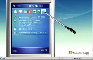
An advantage of introducing a PDA to a new audience, is that’s is general interface works just like a household PC. Navigation around the device is same as we move around our windows XP application. Expect from the start button is positioned in the top right hand corner.
As you can see from these pictures below:
Picture courtesy of http://www.flickr.com/photos/16596182@N00/281089701/

Its common convention of that start button is positoned in the top left hand corner, as this is a familiar with most of the users, they natural instinct could be to start here, and begin navigating around the device just like they would do at home.
So users knoweldge of interaction will be greater and their ability to utilize the device will be much more evident when its presented in front of them.
Its just its screen size is slightly smaller!

Although this way of ‘Windows based navigation’ wouldn’t be so dominant in my interface, I could incorporate a similar interface design and layout in to my idea. The options they are presented with such as ‘Beginning new recipe’ “proceed to checkout’ ‘quit application’ (hope this never happens!) Could all be positioned at the bottom, just like a standard desktop PC, therefore giving the user much more confident as these conventions are what they are used to, and which they perform almost everyday.
This may confuse users who already use a PDA, but with the function of my devices being accessible by all types of users, I think it will be more reasonable to suit common computer users. To be honest with the prices of PDA’s being over £250 not many middle class people would, or could afford this.
It could be an idea to incorporate the Windows ‘START’ interface as a menu structure for my device.
This process of interaction from the user, wont take any time at all to get used to, and wont need much explaining, but some for that cognitive model of mine.

"Conventions, they are very useful, As a rule conventions only become conventions if they work. Well applied conventions make it easier for users to go from site to site without expending a lot of effort figuring out how things work"
(Steve Krug 'Dont make me think' p.35)
Enough of that it think for now, more information will be presented in my interface design research later on.
Before my research I thought there was only one type of PDA, but in fact there are two, well you learn something everyday don’t you! Any way here are the two types of PDA:
  • Handheld PDA
  • Palm PDA
And from this website
http://www.findarticles.com/p/articles/mi_m0ICC/is_7_69/ai_69239315
I can begin to draw a comparison between the two, and find out which one best suits my function for visual display.
If i am going to implement these on the shopping carts within the store, the money side is only a slight concern of mine, if the users had to buy one, then this would of course be much different. But as i am about to explain 'You Get What You Pay For' and PDA's are no different.
As my device is going to run a single visual application, the resolutions and screen szies are going to be the main factor. The handheld (pocket PC) offers a high resolution, ideal for me as a designer as the space, all be it limited starts at 320 x 240 pixel resolution, compared to a 160 x 160 palm PDA. this means a the qaulity of the image within a given size, the greater the pixels the sharper the image.

This explaination and picture is courtesy of http://en.wikipedia.org/wiki/Image_resolution

Pixel resolution

"The term resolution is often used as a pixel count in digital imaging, even though American, Japanese, and international standards specify that it should not be so used, at least in the digital camera field. An image of N pixels high by M pixels wide can have any resolution less than N lines per picture height, or N TV lines. But when the pixel counts are referred to as resolution, the convention is to describe the pixel resolution with the set of two positive integer numbers, where the first number is the number of pixel columns (width) and the second is the number of pixel rows (height), for example as 640 by 480. Another popular convention is to cite resolution as the total number of pixels in the image, typically given as number of megapixels, which can be calculated by multiplying pixel columns by pixel rows and dividing by one million. Other conventions include describing pixels per length unit or pixels per area unit, such as pixels per inch or per square inch. None of these pixel resolutions are true resolutions, but they are widely referred to as such; they serve as upper bounds on image resolution.

Below is an illustration of how the same image might appear at different pixel resolutions, if the pixels were poorly rendered as sharp squares (normally, a smooth image reconstruction from pixels would be preferred, but for illustration of pixels, the sharp squares make the point better)."


Of course the more money you pay, the resolution we become much greater on the PDA, so finding any bigger, would benefit me for the designing, but even this size would be adequate.
It also offers the ability of handling 16-bit- 65,000 colours; this will allow my interface images and colours to be much clearer and more true. Theses strength will make product packaging, and images on the interface more recognisable and distinctive.

And finally for the screen sizes, an obvious constraint for me as a designer, It won’t be as easy as designing for the web, completely the opposite I expect.
Screen sizes are measured diagonal. Ranging 2.2inches up to a massive 4.5inches. I say ‘massive’ but in relation to the device this is very big. The more room on the screen, the better the interface will be as everything is evenly spread out over the interface, and not all crammed into a small space. Also it think from a user point of view the larger the screen the better interaction they will have with the device. It is very difficult to show a true image on this blogger site with regards to the size. But obviously the bigger the screen, the easier it will be to design for.

the PDA which i am going to be designer for needs to be a Handheld PDA, simply for the fact that is can handle high graphics, better image quality, and the main reason it that they have a larger screen dimension to that of a palm PDA.
Running a simple, single application on the PDA, these quality will help the user as they interact with the device more easily and more confortably. If their interaction is precisely that, then I have a good chance in succeeding with this device.

Here are some links to help you choose the right PDA for you

http://www.pdamd.com/vertical/tutorials/buyersguide2.xml

http://www.webmonkey.com/webmonkey/98/39/index4a.html?tw=archives
http://www.bizhelp24.com/it/choosing-the-right-pda-personal-digital-assistant--4.html
http://www.digitalnetwork.co.nz/choosingaPDA.htm


Saturday, November 18, 2006

Research- Overview

Designing for any small screen device weather it be a Mobile in your pocket, an iPod clipped to your hips, or a satellite navigation system on your cars dahboard, its screen size is going to be the obvious constraint from a designers point of view.
As time goes by, the resolutions of these devices are likely to increased, but its physical dimensions are not going change, if they get to big, their not going to be a 'Mobile Device' anymore.

Thought and consideration needs to be in order, I just can't put large amounts of information on the screen in the hopes that something there will be what the user wants to see, as the small screen size will simply not let you.
Research is key, not only do I need to look into the interaction design and usability testing, but knowing your end user/target audience is cruital. Their preferred mobile device and their sizes are areas that i will be looking into.
A small device with a small screen will force single-window interaction. So its interface navigation is going to be that of simplicity. Slightly different to our interaction on the web, where the possiblities and navigation could be endless and confusing.
This 'Mobile Web' needs to be capable of user needs when they are on the go, hence the world 'mobile' an idea does not need to cram as much as we can into the interface, focusing on the users end goals and requirements and helping them acheive this with ease.
To get the best out of our device i think research into how the device is used, and who uses it is needed, therefore limits the bounduary ideas and just focuses on the main concepts. I need to know the users capabilities and limitations, getting an insight into their daily life and usage all helps to making the prototype successful.
From this information we can understand the context within which they use the device, understand which tecnology is best suited for their context, resulting in designing systems that are as simple as possible which suits them.

The ways in which users interact with a system or product isnt just down to its design interface which we make, it also has a connection with the phone features itself.


An example would be Navigation, the Sony Ericsson mobile has a joystick for up, down, left, right movement, a push button(thejoystick itself) with 2 buttons either side for Call/Select and Cancel/End call.


http://www.sixthseal.com/images/se_k700i_keypad.jpg

Or The highly successful and user friendly iPod which incorporates another design feature, for the user to navigate around their playlists their is a Apple Click wheel. The user performs a rotation movement around the wheel which scrolls up or down, with the 'Click' button which takes them to the next screen from which they have clicked. On each side and top and bottom there are press buttons which double up allowing different outcomes,REWIND, FORWARD on the side, and MENU,PLAY/PAUSE on the top and bottom.

http://store.apple.com/1-800-MY-APPLE/WebObjects/AppleStore.woa/wa/RSLID?mco=1B65A5BF&nclm=iPodnano


Each device has its own functions and features and this Tom Tom Go 510 is no different, this concept is completley different to that of the other two, this device incorporates a LCD Touchscreen navigation, there are no buttons they claim
'with just a few taps of the screen you’ve inputted your destination and are all set to go'
http://www.maplin.co.uk/images/full/45915i1.jpg

so there are many different devices that have different functions/features, not only will i need to investigate my design interface, but also what platform the device is, and how my design will incorporate their design aesthetics and ergonomics.
So all these these aspects will need some careful consideration and expantion, reserach into how other devices accommodate these will be useful, and find a soulution for my idea.

Friday, November 17, 2006

The Royal Bank Of Ideas

http://d4dd.blogspot.com/

I have an idea, that i wanted to put for to you.
So here it is

THE GREAT FOOTBALL DEBATE

Every nationallity or country i have travelled to in the past, insist that their home country is the ultimate footballing nation, and even their supported football team is the best in their domestic leagues.

All the hype kicks off at the beginning of the domestic leagues from around the world, with new players arriving at different countries and clubs, whether it be for footballing reason, family, or in this day and age the money, all signal to each of us that these players are here for a reason, and they believe that this country is the place to play.

Examples would be Van Nistelrooy at Real Madrid is Spain, Shevchenko at Chelsea in England, and Patrick Vieira at Inter in Italy.

Maybe the amount of Champions League Trophies that have been won by each nation could determine it?


But i think the fans have something to do with this aswell, their dying passion, knowledge, heart, motivation, dedication and their ability to create an amazing atomsphere at the game is shown very clearly.

So why not let them decide?

THE GREAT FOOTBALL DEBATE could be the ideal place for everyone around the world to talk about football.

Like Flickr the user would have the ability to send the following from their phones. (the mobile is my Digital Device)

Views

Personal Information & preferences- (this would be their account)

Latest news & Gossip

Teamnews

Predictions

Picture from the game, their seat number!, the stadium, the fans, famous pictures (meeting players) their ticket Etc, they could even find out they were sitting next to each other and didn't know it!

Videos of goals, or tricks

Third Eyes- an image or video that not many other people see. The Perfect Picture

Information on previous meetings- stats and statistic

Latest transfer news- on their teams, players etc

Lyrics for Footballing chants for the new supporters

Information on tickets

Traffic information
Information on the local area, Which pubs, restaurants, and hotels are good, this would be brilliant for traveling away supporters, especially those travel from abroad. They can gain information without having to look around the internet.

Information about new upcoming games: this information could provide details of the next game, users could chat with each other, maybe even meet up before the game for a beer, just so this concept of digital communication could become a reality. Fans from the same club or others could discuss their ticket numbers for the next game, resulting in fans finding each other sitting next to them, but knowing a bit more about them, and having something in common with the guy sitting at BLOCK 113, ROW 29, SEAT 619!!!

I think these ways of getting nations in football to communicate in a friendly way may improve national/footballing relationships, and improve the image of friendly rivalry between fans and clubs.

I have researched into this idea, examples of football forums which would be suitable for a small screen device, example would be www.teamtalk.com they have a feature on the right side of their page YOUR SAY, in a small black box, this is an forum where people talk about their team, give opinions and predictions. This would be an example of how the interface would look on a mobile, ok the screen is slightly big, but it shows this wouldn't be hard to implement onto a mobile screen.

there are many sites which have football forums but don't have the capabilities of using a mobile device in conjunction with their site. examples would be

http://www.thefootballforum.net/forums/index.php
http://forum.football.co.uk/
http://www.thefootballforum.co.uk/

Also incorporating another digital device could be an option. Fans could connect to a online broadcast whilst at the game and maybe give a 'Fan Zone' like commentary from the game, other users would be able to find this frequency either on their iPod or mobile and listen to live streaming of the game from a 'Real fan' with heart and passion much better than Andy Grey don't you think?

I think using an digital device for this medium will create a 'LIVE' atmosphere, users can send pics and views, receive other pictures, meet new people, whilst at the game

A footballing community will be created! let me know what you think. please.

Friday, November 10, 2006

Welcome to the Brief

Hello, well my first entry into my blog, bit clueless at the mo. This blog is to help me create a greater understanding of the technology of digital devices such as Mobiles, PDA, Sat Nav, and iPods, how they are incorporated in to social networks such as this site, Blogger.com, Flickr.com, myspace.com, and mybook.com. (just a few examples) and from this information which is created on these social networks think of a device which it can be incorporated into.

With this device think about how you the public can find this information, share it, play with it, talk about it and recommend it to others in the community. The importance of the screen size of the desired device is very important depending on the function e.g Text, Pictures, Music and Videos.
An example would be Flickr.com where the user has the ability to upload photo's to their account by the use of the mobile phone, and share it with the world, in return comments, sharing and recommending is produced through groups, tags, and new entries.

Ideally I want this device to be Web 2.0 accessible. let Wikipedia tell you!

It refers to a supposed second-generation of Internet-based services — such as social networking sites, wikis, communication tools, and folksonomies — that emphasize online collaboration and sharing among users.' (from http://en.wikipedia.org/wiki/Web_2)


Examples of Web 2.0

Web 1.0 Web 2.0
  • DoubleClick --> Google AdSense
  • Ofoto --> Flickr
  • Akamai --> BitTorrent
  • mp3.com --> Napster
  • Britannica Online --> Wikipedia
  • personal websites --> blogging
  • evite --> upcoming.org and EVDB
  • domain name
    speculation --> search engine optimization
  • page views --> cost per click
  • screen scraping --> web services
  • publishing --> participation
  • content
  • management systems --> wikis
  • directories (taxonomy) --> tagging ("folksonomy")
  • stickiness --> syndication
So my brief is to think of an event or product that gets a message out to the people, but gets people in through mulitply devices. Planning for a specfic device will require research into what they do with this device, how much they use it, and when. Think about output devices and where this can implemented.
It should have the ability to let the user do want they want, they are my target audience, so they know what they want with reguards to content and functionality.

Any suggestions are welcome. I will be updating this blog with new ideas and concepts.