Initial Corporate Indentity
I thought as I have a name for my device and a function, i could mess around with the logo design and layout, these are just a few prototypes of design for the REICIPE FINDER, have a look. I have also tried to see how my device would or could be incorporate with a major supermarket like Sainsbury's. See what you think
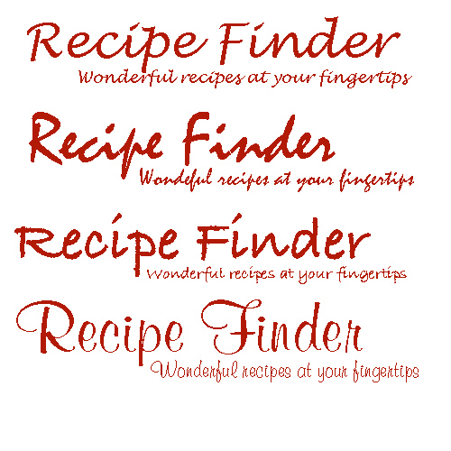 This above was just a range of different typefaces, I wanted it to be flowing with class and sophistication, I thought cooking a luxury meal with my device should be reflected in my luxury text!! it gives a sign of class to my users, something that their end product will be also.
None of these type faces are chosen on just yet, but it gives me a few ideas.
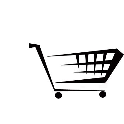 This was the first design for my logo, I designed this is photoshop using a range of different sized lines, and then distorting a skewing them to make to sharp points. I wanted the logo to look modern and comtempary, as my device is new in technology, the Logo should reflect it. And I think it works, and obviously my device will be implemented in the supermarket on a trolley, so.........
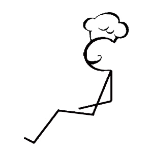 This is the chef, a simple but effective stick drawing in photoshop, I also made a chef's hat that sits on top of his head to make it more recognisable for my audience to work out, also the comedy chef's tash was also implemented on his face to add a bit of humor to my design. The reason the sitting position is shown next. He's not on a toliet!!
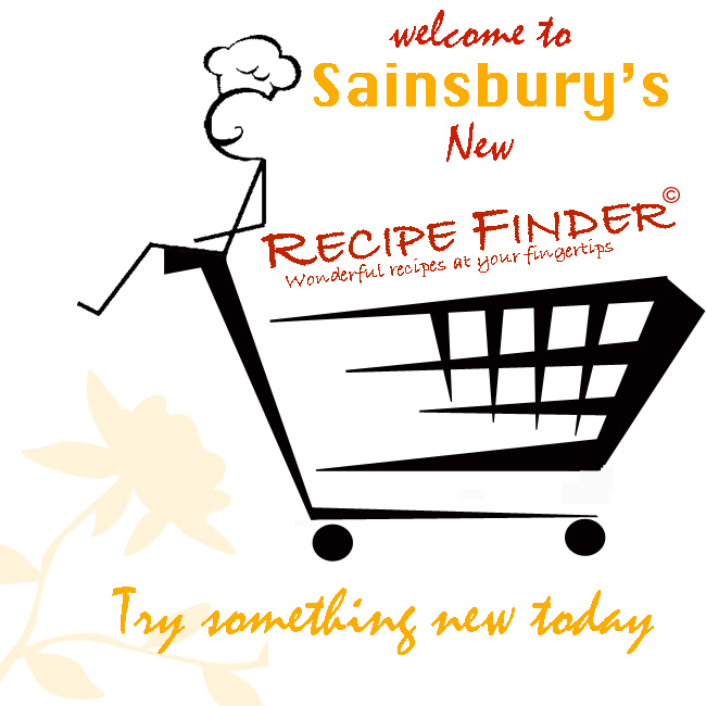
 This will maybe be my final design, the reason for the chef sitting on the front of the trolley symbolises that the PDA will be positioned on the front handle of the trolley, it is bascially like having a chef in front of you as your shop around, this is the man inside the PDA giving you all of these luxury recipes to cook.
Ok thats the main design for the corporate identity, it will probably be modified later on, but it shows you my design process.
The next part happened when I woke up at 7.30 this morning to play football, much to my dissapointment the game was cancelled due to the lovely weather down here in Portsmouth, so I thought I might aswell turn my MAC on, and when browsing, i saw a advertisment for Sainsbury's on a webpage, I can't remember the website but it thought about how my logo design could be incorporated into a advertisment for SAINSBURY"S.
 This could be implemented on posters in store, adverts in magazines, or even a pop up advertisment on the internet. In have used Sainsbury's corporate indentity with their orange colours and slogan at the bottom, but I thought if a major corporation was to use my device in their store, then more than likely they will make my logo match their identity.
CLICK TO ENLARGE IMAGE
The Sainsbury's colours have taken over my product! but in a way looks far better than the black, I suppose any corporate colour would be choosen over the black. these were just a few quick ideas I made up at 7.30 this morning. it just gives me a slight overview on how my design would look within a business identity.
posted by AdamT @ 4:58 AM
4 comments
![]()

4 Comments:
Ok quick thoughts....
the logos just wont work on small screens they are too fine and linear. Think block colour and simple block shapes. Dont put too many colour gradations in it either...
I like teh idea and ofr this unit it works. I like the iea of something that is available in the store...
My main suggestion is that if you go to Waitrose they have a self scanning device at the entrance..what I would do is to combine the devices and make it smart...it looks at what you are buying, suggests recipes at the touch of a button, tells you where the ingredients are in the store and how much it will cost for four people...
not sure its quite viable commercially but thats not a main concern of the unit.
sorry about the spelling I am typing laid on my back
Yes I agee with Richard about the logos you should try working at actual size to get a better idea of what works...or try a simplyfied version at a reduced scale.
The smart scanner, which checks your basket and tells you that you if you BOGOF on this chicken breast you can make stirfry or an italian or a indian or mexican dish by buying one or two extra ingedients...using what you already have in your basket.Or making further offers.
Companies have been putting recipies on the back of packaging for years, you have to think about how maximise the ingredients, for each shopper customising the service.
You could even question how supermarkets are set out,in my supermarket, milk is in the first corner of the store, while bread is at the opposite far corner. In order to do a basic essentials shop, I need to cover most of the floor with my trolley. That means I'll be exposed to a lot of products I didn't come in for, and pass a lot of aisle-end promotions.
How will your device speed up the process?, if I have a list I end up walking back and forth alot more as I pass things. The list is not organised in the same sequence as the layout of the store.
Stores
You could even construct a weeks recipies from 15 to 20 ingedients,
You could make the assumption that all products are tagged with RFID (search for the RFID blog and RFID on wikipedia.com) chips and so the scanner could read teh products as you get near them.
The current waitrose ones are just barcode scanners so are pretty dumb but the tech to do what you want exists...
re the logo, do some mockups on a grab of a pda screen or a phone screen - choose a smartphone.
Post a Comment
<< Home